CNN Digital
CNN Multi-Platform Video Systems
Branding & Design

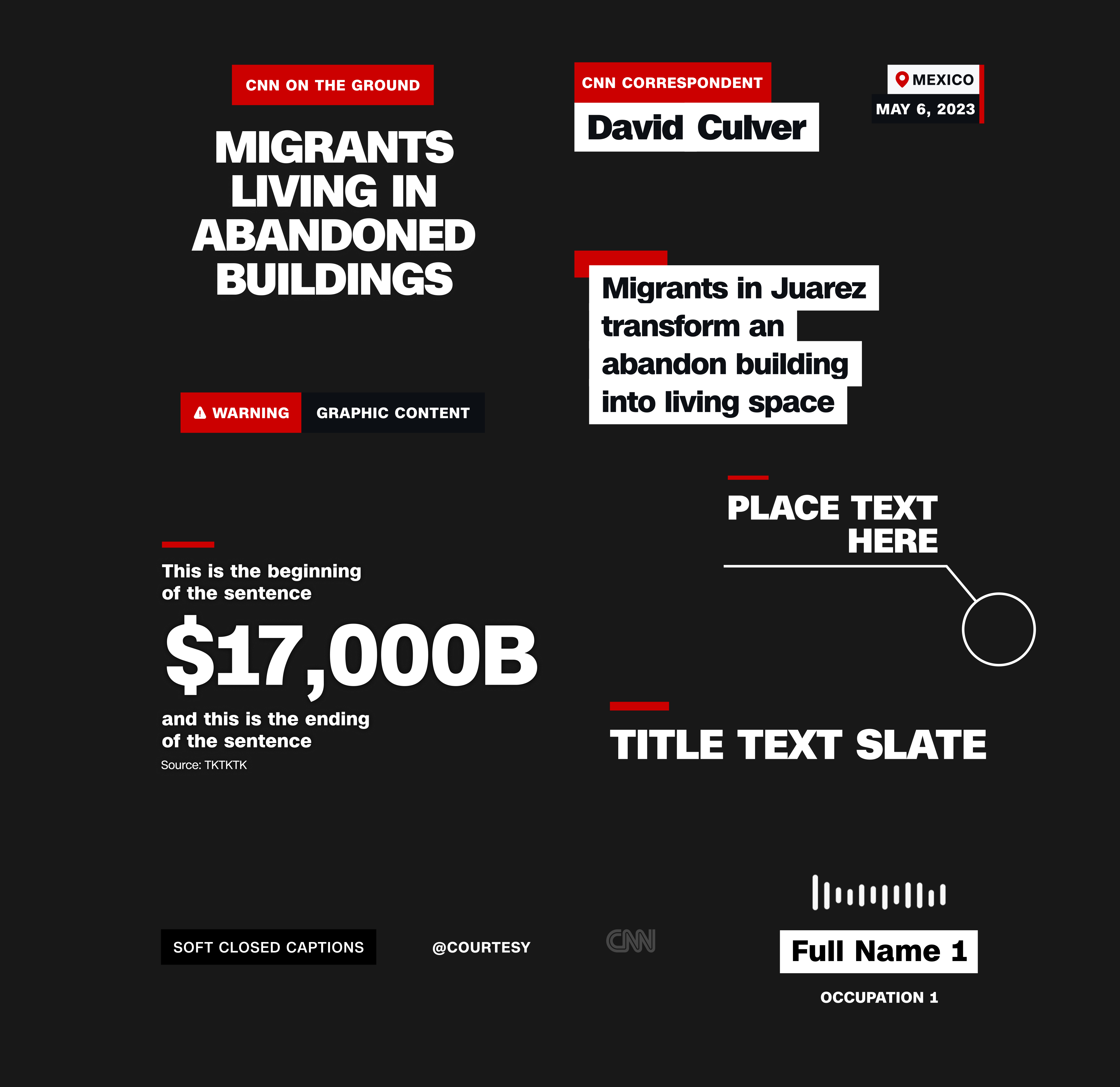
_MULTI PLATFORM VIDEO BRANDING
_BULLET POINTS
_AUDIO CLIP
_DISTURBING IMAGES
_CORPORATE STATEMENT


_FRAMED FOOTAGE
_BIG NUMBER
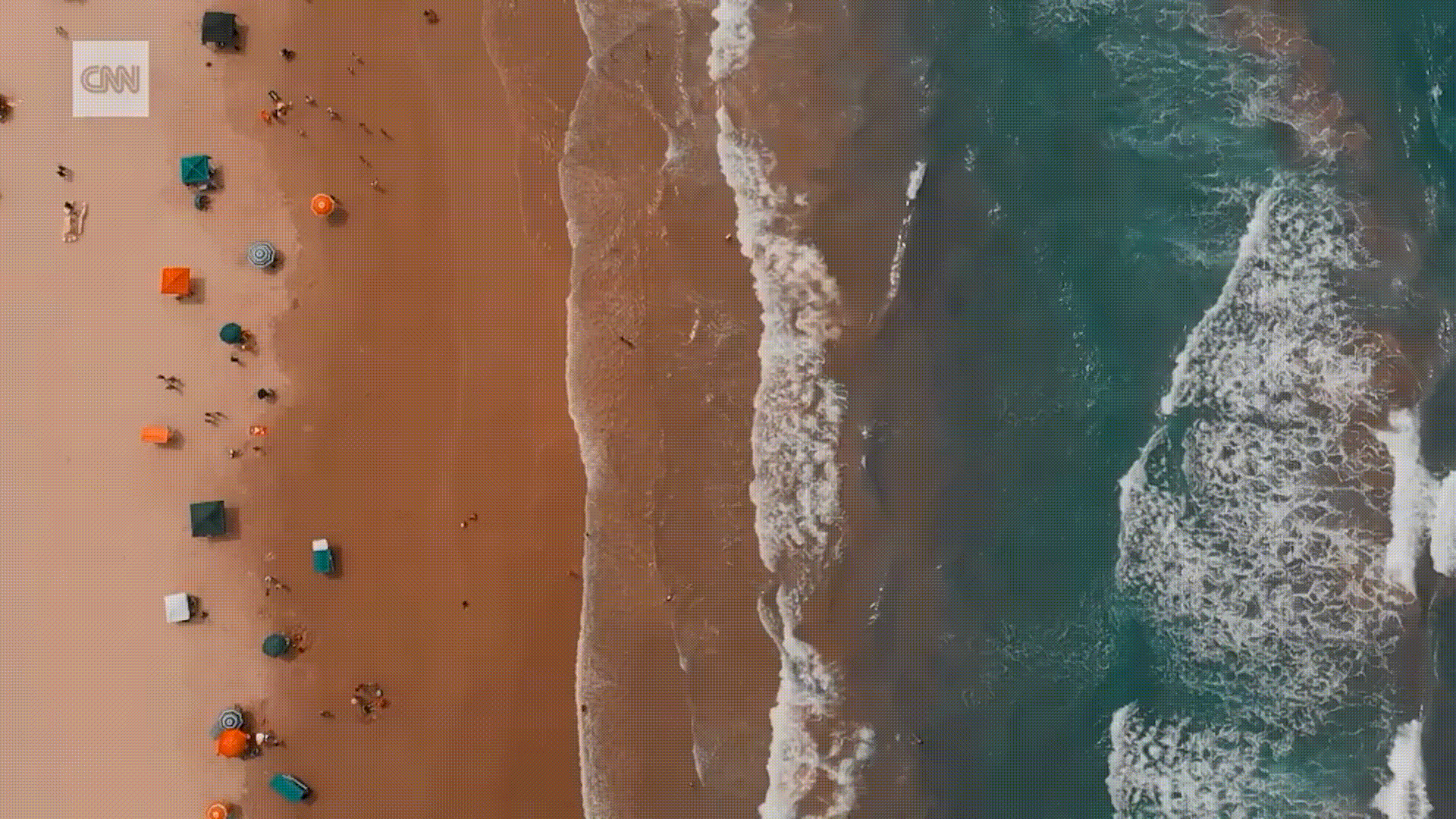
Led the art direction and design of a scalable visual system for CNN’s digital platforms, built for use across marketing, social, on-air video, streaming and mobile.
The system was designed to maintain consistency at scale while adapting to both horizontal and vertical formats, supporting fast-moving, multi-platform storytelling/ journalism.
All templates were created and maintained in After Effects, enabling 350+ video producers to create 5,000+ videos and stories on quick turnarounds globally, across English and multilingual teams (Spanish/ Arabic).
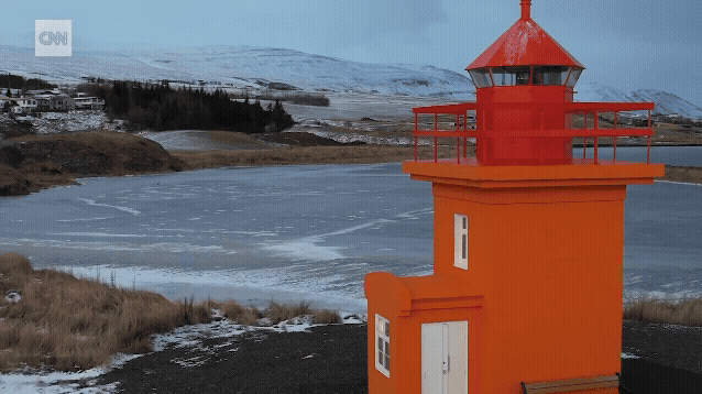
CNN on TikTok, Instagram, YouTube Shorts
_VERTICAL SAMPLES
Art direction & brand design lead: Elisa Solinas
Motion Designer: Agne Jurkenaite, Taylor Su, Patrick Gallagher
The system was designed to maintain consistency at scale while adapting to both horizontal and vertical formats, supporting fast-moving, multi-platform storytelling/ journalism.
All templates were created and maintained in After Effects, enabling 350+ video producers to create 5,000+ videos and stories on quick turnarounds globally, across English and multilingual teams (Spanish/ Arabic).
CNN on TikTok, Instagram, YouTube Shorts
_VERTICAL SAMPLES
Art direction & brand design lead: Elisa Solinas
Motion Designer: Agne Jurkenaite, Taylor Su, Patrick Gallagher
CNN Digital
CNN Motion
Design Branding
Motion reel of work I currently have the privilege of leading as Art Director for CNN Motion, alongside a multi-talented, international team of designers.
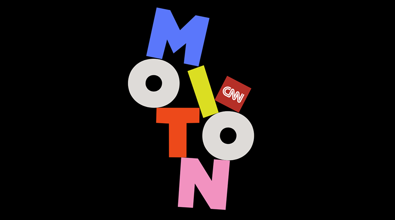
CNN’s internal motion graphics team developed an updated brand system for CNN Motion to support a wide range of storytelling across digital platforms. We chose the logo font: Poleno (with modified O). The goal was a bold and flexible identity that supports different story formats and reflects the depth of CNN’s editorial depth.
The refreshed branding offered a fresh take to present motion content. It strengthened internal visibility and provided a unified framework for producing high-quality motion pieces across CNN Digital multi-platforms.
Visit our CNN Motion site on cnn.com
_REEL PROJECTS LIST
00:02-00:04 Extreme Heat
00:04-00:07 Skin Whitening Creams
00:09-00:12 Nigeria: Kito
00:13-00:17 Beyond the Binary
00:18-00:20 Pelicot Case
00:21-00:23 Beyond the Binary
00:23-00:25 QAnon Letter
00:26-00:28 Air Pollution
00:29-00:31 Heartbreak and the brain
00:32-00:34 QAnon Letter
00:35-00:37 Tipping Interactive Quiz
00:38-00:40 Skin Whitening Interactive
00:40-00:41 Women are tired
00:44-00:46 Fitness Interactive Quiz
00:46-00:49 Good news generator
00:49-00:51 Russian casualties
00:52-00:54 PTSD Soldier
00:55-00:57 The Hippie Trail
00:57-00:59 Skin Whitening Creams
01:00-01:02 Chance Encounters
01:03-01:06 Rewiring the brain
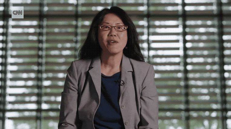
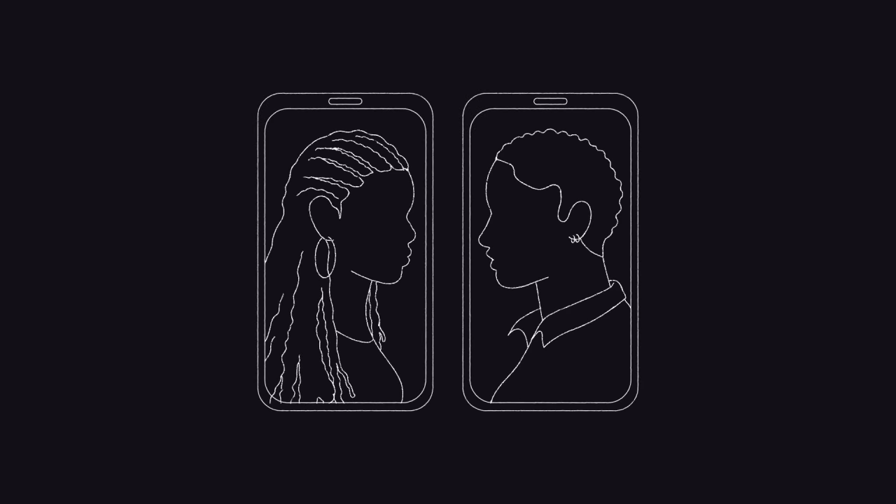
This piece follows Kyle, a U.S. soldier struggling with PTSD after returning from Afghanistan. It’s part of CNN’s Life After series exploring personal change after trauma.
My role as art director was to guide my team to create a visual way of representing Kyle’s story that felt universal and easy to connect with. We used silhouette animation and visual metaphors to express emotions like fear, grief, and isolation inclusively, so anyone with PTSD could relate.
The animation used soft transitions and symbolic cues to reflect the internal struggle. These choices were made to show respect for Kyle’s experience while allowing space for viewers to see their own stories. The piece was released around Memorial Day weekend, a fitting moment to invite reflection and solidarity.
Watch and read more about this piece on cnn.com
Supervising Producer: Jacque Smith
Lead Producer: Madeleine Stix, Katherine Jennings
Art Direction: Elisa Solinas
Design and Animation: Kelly Flynn, Taylor Su, Agne Jurkenaite
Sound Design: Katherine Jennings
Awards:
2024 Emmy Nomation for Outstanding Graphic Design & Art Direction
2024 Society for News and Design Award of excellence in Animation design
2024 Webby Awards Honoree
CNN Digital
The dangers of finding love online as a queer woman in Nigeria
Interactive Storytelling


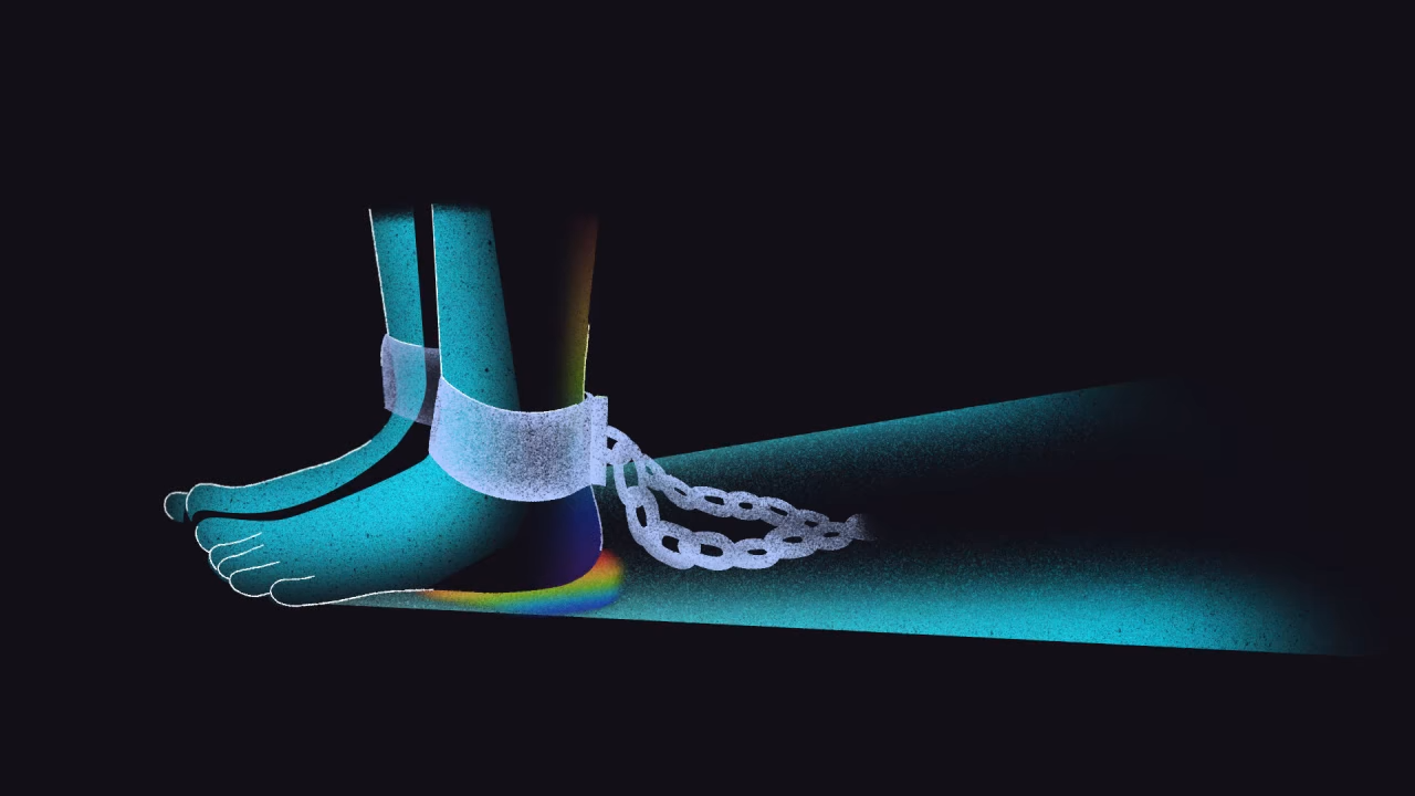


Being a queer woman in Nigeria means constantly watching your back online for abusive individuals or gangs trying to catfish, attack, or “convert” you because of your sexuality. CNN investigates this abuse, locally known as “kito.”
As art director on this interactive piece, I guided a conceptual creative vision, highlighting the dangers faced by queer Nigerian women. Keeping a sensitive and impactful tone through color palettes, layout and animation to highlight the tension and vulnerability of the story while engaging the audience.
Check out the full story on CNN’s interactive page
Reporters: Adie Vanessa Offiong and Ian Wafula
Commissioning Editor: Meera Senthilingam
Editor: Eliza Anyangwe
Animator: Taylor Su
Designers: David Blood & Taylor Su
Developers: David Blood and Lucas Seidenfaden
Visual Editor: David Blood
Art Director : Elisa Solinas
Audio Editor : Matt Dempsey
Photo Edito : Sarah Tilotta
Awards:
2024 Silver Lovie and People's Lovie Winner in Websites & Mobile Sites: News & Politics
I was brought in to develop initial design concepts for TED’s new logo animation. The brief called for a minimalistic approach to TED’s existing logo, exploring multiple variations in different environments, including dark mode and light mode. My work focused on aligning with TED’s minimalist branding while symbolizing the spreading and sharing of ideas.
I created several explorations, presenting black environments and light mode options to ensure versatility across platforms. These concepts served as the foundation for the project.
Although I was not involved in the final stages of production, my initial ideas played a key role in shaping the direction of the TED Talks logo animation, which was later implemented and published by another studio in 2022. My contribution to this project reflects my ability to create compelling, on-brand visuals that align with TED’s global mission.
Additionally, I created the TED Salon Opener, a key branding piece used for marketing and events. The opener aired as part of TED Salon’s initiatives, elevating the event’s visual identity and enhancing audience engagement.
TED Salon Page
Role: Art Direction and Motion Design
Creative Director: Mike Femia